I thought this chapter was very interesting in how it took a brief and broad approach to the history of type. There was a lot of information covered, but it was presented in a visually stimulating and interesting way. The use of a timeline format with small pieces of text was effective in holding the reader's interest while still getting across all of the points. I also appreciated the small uses of color in the bright orange labels to direct the eye between information and images because it made the page much easier to scan and interpret, especially with all the black and white at the beginning.

 |
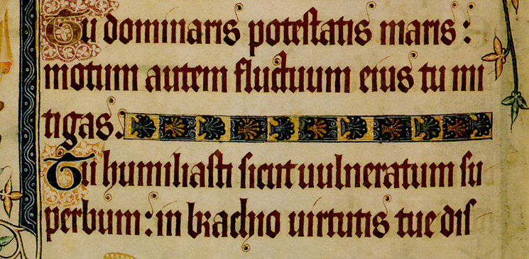
Gothic Textura (top) vs
Roman writing (bottom) |
Content-wise, one of the most engaging things for me was to watch the ever-shifting balance between simplicity and elaboration in design. This dichotomy was present even from the earliest forms of writing - while the Phoenician Alphabet was
made of symbols that could be written in a few strokes, Egyptian hieroglyphics were more symbolic and nature and involved drawing full beetles or birds to get a point across. The flow between simple and complex continued with the cleanly serifed forms of Roman writing compared to the condensed letters of Gothic Textura Quadrata, the easily readable forms of Egyptian slab-serif fonts and the detailed ornamental illustrated type present in the mid 1800s, and even continues in the stark contrast between Emil Ruder's clean lines and Stefan Sagmeister's expressive, handwritten work in the modern day.
  |
| Examples of Stefan Sagmeister's and Emil Ruder's works |
I think that both schools of thought when it comes to design have interesting and beautiful outcomes, and I'm going to be more aware of the contrast between simple and elaborate when I look at the designs around me from now on.


When reading your reflection I was very intrigued by your elaborate reaction to the evolution of typography through the years. You went into a brief yet detailed description of the difference between each design that you came across, which helped me understand how similar yet contrasting each time period was in regards to typography. After reading your chapter one reflection, I too will try and be more aware of the differences between simple and elaborate designs.
ReplyDelete